TREND IMAGES
The Brussels Furniture Fair offers a foretaste of what you can expect in 2024 and beyond.
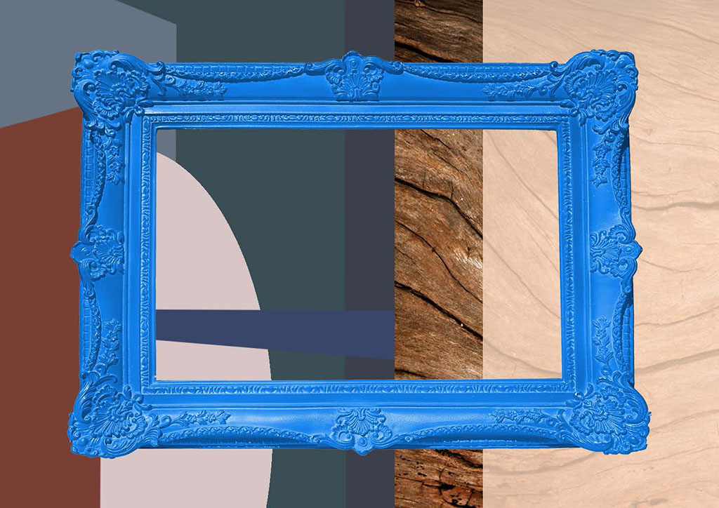
What are the latest developments? For this, you can look at individual exhibitors, who present a down-to-earth offering in line with the market. But what’s in the air? What’s going on? What’s the big picture? We present this through the trend images in the passages between Halls 3 to 6.
The common thread is ‘green’. Furniture is Furnature! You walk through the Urban Jungle from trend to trend to trend. This plant-based decor confronts you with nature. That is the source of life on earth. That is where the roots of our industry lie.
Just like in nature, the furniture seasons also change. Here too you can see them changing: the seasons are becoming longer. The fashion for short-lived furniture is a thing of the past, and has evolved into a style trend. Within a style, you see changes in emphasis. For the coming time we have distilled three of these styles. Each style trend alludes in its own way to nature.
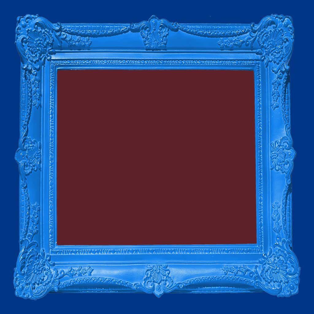
EXCESS CHIQUE
The foundation is timeless classic. Excess Chique is bathed in an atmosphere of rugged nature and the rustic idyll. Rural life is a fabulous source of inspiration. Nature is an amazing world. And if the heart is filled with it, the interior will overflow with it. This will manifest as rich decoration with standout pieces.
The classic colours reflect the earthly pleasures of nature: the wine red in your glass, the night blue of the sky, and the emerald green of the gemstone. The materials are nature’s luxurious pearls: dark mahogany and walnut. The fabrics pull in the other direction: a sturdy herringbone versus a more luxurious velvet.
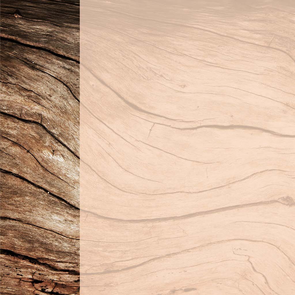
PEACEFULLY CURVED
The design language is downright organic. Peacefully Curved alludes to nature as the archetypical mother. This conjures up associations with all things soft, warm, cosy, safe and secure. Your lifestyle and interior style revolve around cocooning (both indoors and out) and wabi-sabi. Greenery indoors plus (a view of) a slice of the outdoors works wonders. You are immersed in the sensory experience, relishing it with all your senses. The same is true of your interior. What a soothing thought! Hence the pale colour palette: warming chalk, neutrals, mellow peach, mint and lavender.
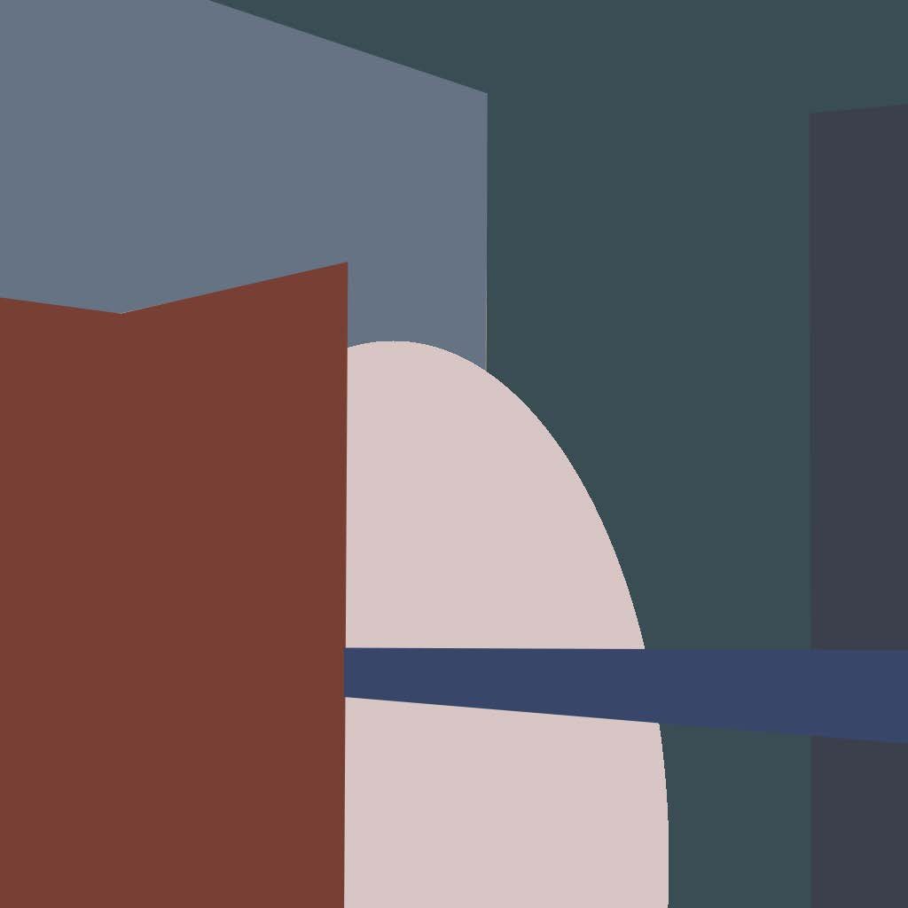
COLOR INFUSION
In the natural world, extremes and paradoxes are the norm. Contrasts harmonise with one another. First and foremost, Color Infusion is about the amazing colourful splendour of nature. The world of brightly-coloured flowers, multicoloured birds and fresh fruit. In the interior, funky colours are pretty bold. They invite you to play with them, to experiment. Will you opt for 100% uni or colour blocking? Matching colours such as lime and pink set the tone. They inspire you to dream of other times and distant lands.