The story of Otis
Otis is the latest asset in the Moome collection. It’s more than just a modular sofa. Studio Segers tells the full story behind the design. Afterwards you’ll look at the Otis with fresh eyes.
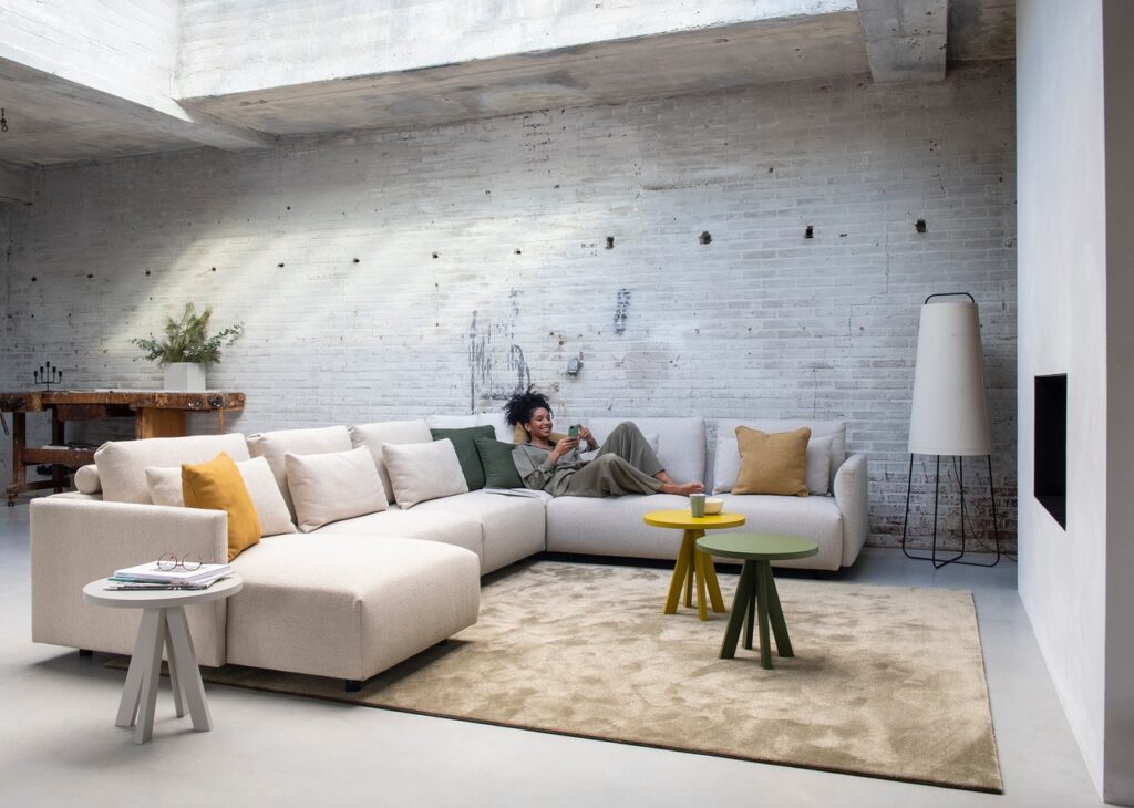
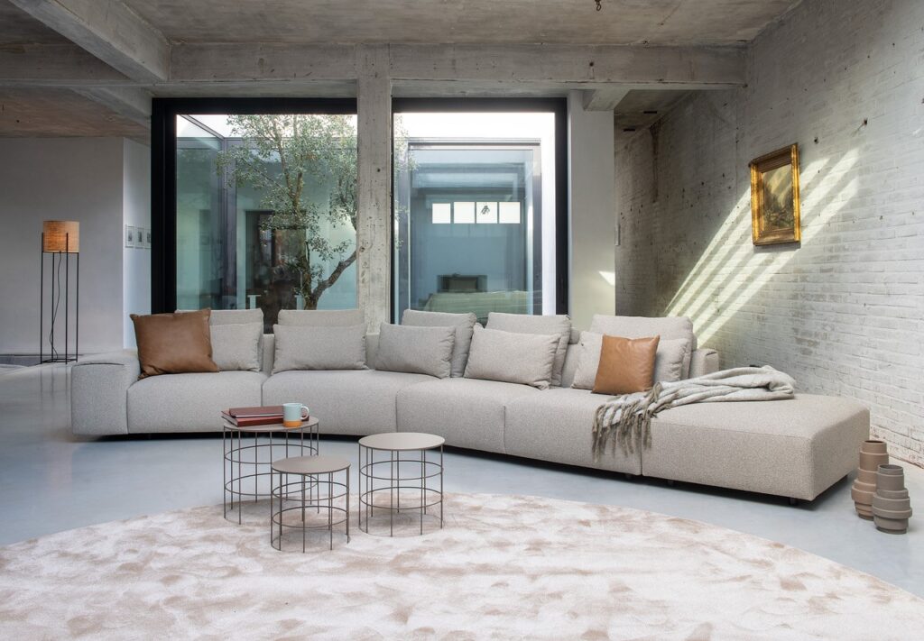
The starting point was a compact, universal and affordable design. This was underpinned by a softly geometric modelling. The rounded contours make the solid seating blocks feel far more friendly and appealing. ‘Come on, take a seat.’ High front, decorative and lumbar cushions amply compensate for the rather low back (60 cm). So you can nestle comfortably on the sofa in amongst the cushions.
Then the details: the number of seams has been kept to a minimum. In the corners the fabric is folded inwards like an envelope. This makes the soft lines even more powerful. It means that there are no sharp seams on the corners. The 5cm-high feet are hidden, thus creating shadow effects. The dark lines delineate the seating blocks, making them appear to float.
Finally, the crucial question. What makes Otis so special? “The extreme modularity: a quite limited number of elements versus a maximum of configurations.” From a two-seater sofa to a spacious lounging corner, anything is possible. With a pentagonal module you can build an ‘obtuse angle’ sofa. There are four arm options, from a 36 cm-wide block to a slim 7 cm model. In addition, there is a huge selection of fabrics and leather. All in all, Otis can be deployed in a wide range of settings.
The basic, neutral design allows for almost unlimited individual customisation. You become the architect of your own interior. In short, Otis is a good story.


